
UX issue - Mobile Survey Nav (tested on 300 users)
complete
A
Adam Maynard
Hey folks,
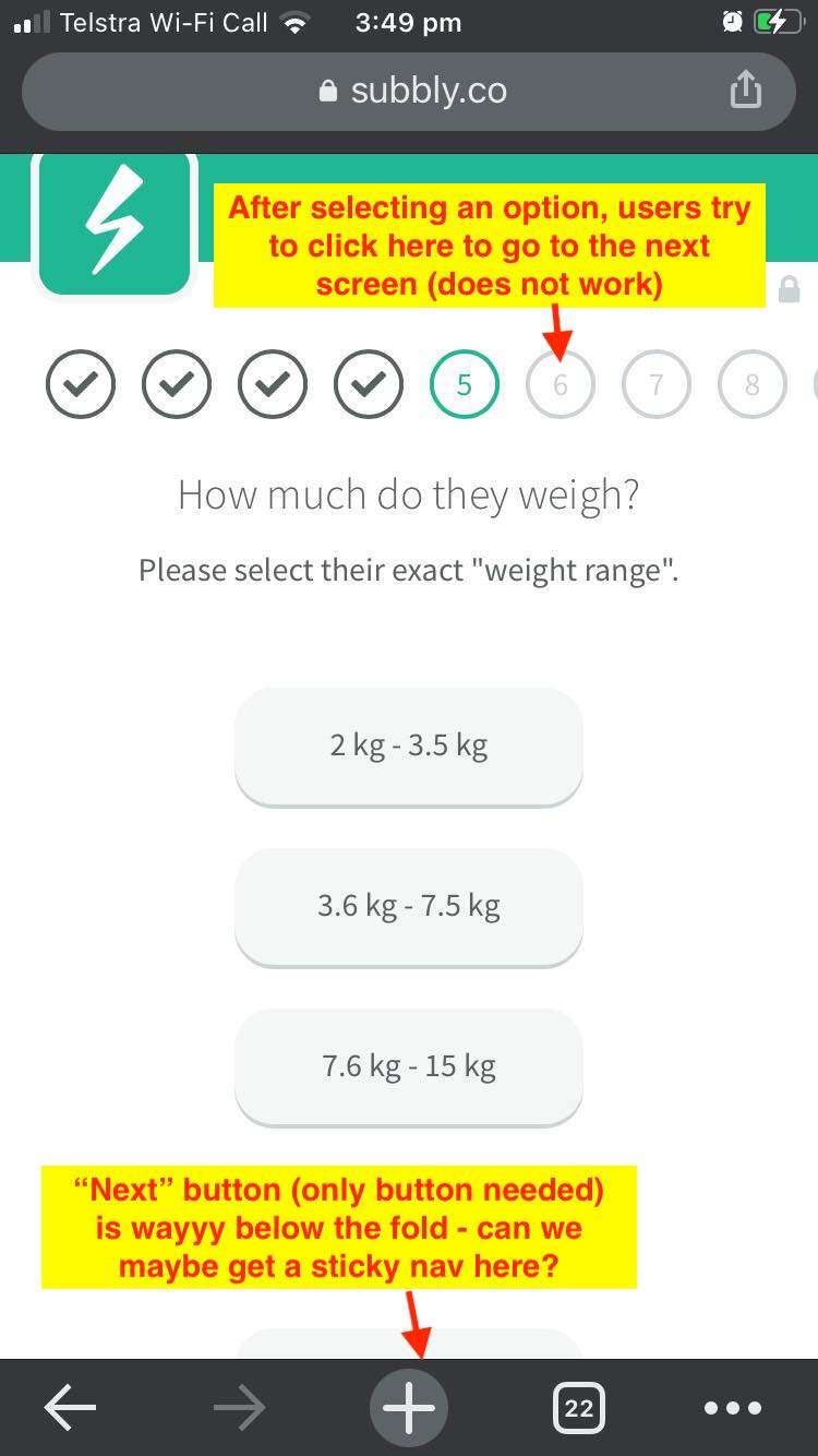
On the desktop, the survey nav is sticky - however on mobile we have recorded approx. 300 people who are super confused and exit the screen (and we miss the sale) ....because the user uses the mobile phone nav instead of the Subbly nav (please see screenshot to explain further).
The attached screenshot shows the exact issue - and why it's confusing.
I think if the mobile nav could be "sticky" like the desktop it would be MUCH more intuitive and help with onboarding more customers!
P.S. Obviously the sticky nav would need to be small, but lots of other websites do this.
Cheers,
Adam

Andy🤠
complete
Hey guys. This one was rolled out a couple of weeks ago.
Feel free to reach to us or create new requests😉
Andy🤠
in progress
To make nav work as "Next step" button when the answer is selected – is a reallu good suggestion, that we are taking in development.
Though the nav is sticky for me. Please, share more details on screen size and browser you're testing on.
Tom Tryon
We also have customers struggle with this and abandon at this point
Andy🤠
under review
S
Subbly requests
Andy🤠: Hi Andy any news on this, we are having massive issues with customers on mobile who do not see the next button. Hopefully it become a priority as it's really important for any business who uses your survey function.
It's a major UX issue (not feature request), could you please look at with priority.